Typography Images
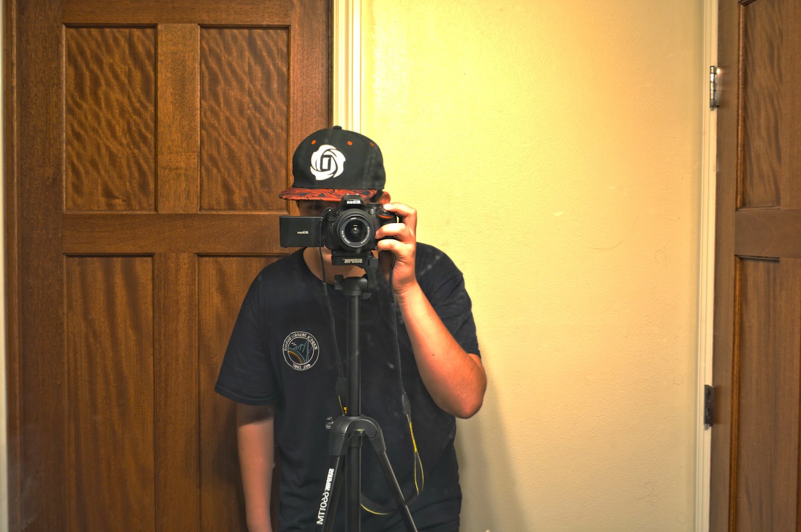
Typography is when you take a self portrait of yourself and put words that describe you over it. I think the words support the pictures a lot by using those describing words and making the picture more intense. It also impacts the picture because its more artistic and abstract.
My Biggest challenge was too follow directions clearly because i was falling behind. I overcame the issue by getting help from people and finish it on time.
Each of my images is very different from each other. My first experience with typography was our innovator project and that gave me a look into what we were going to do, The next project w did with typography was Teacher Portraits, we took pictures of teachers and did typography on it this gave us a look on a better and more quality and colorful typography portrait. Our final portrait was our ME portraits they were all the things we learned and we put it together, This image was my most quality and best portrait of them all.


I like your words
ReplyDeleteMake your background match with your words.
I can tell that it is you
I really like the colors you used!
ReplyDeleteYou could've filled more of the blank space, there's a lot of blank spaces
I also like how you can see the words really clear
The colors are very nice and vivid
ReplyDeleteSome of it is not visible
Interesting choice to choose red for your highlights.
I really like the colors that you used.
ReplyDeleteOne thing that can be improved is the visibility of your pictures, The teacher picture isn't really clear same for your portrait cant really tell that it is you.
I like the content of your paragraph.
Great Practice!
ReplyDeleteWhat is the red?(Matching Colors, Etc.)
Great "me"!!!
I like the back round
ReplyDeletecould be better: Make the words more visible
I also like the words you used and the colors
I like the words you chose.
ReplyDeleteYou should have put the words closer together.
I like how your overall image matches.
Your image looks like you
ReplyDeleteyou could improve your image by making your highlights not stand out to much
Great words